Comparative Analytics: Trend Analysis
The Trend Analysis page allows you to see how individual dimensions have trended over a period of time. For example, if you want to see how the Operating Level for the Customer Support department has trended over the last year, the Trend Analysis page lets you easily do that.
Accessing the Trend Analysis page
To access the Trend Analysis page, first select the “Comparative Analytics” page from the “Reports” drop down on the left. Once on the Comparative Analytics page, you can either:
- Select “Trend Analysis” on the top right of the page
- Select a several dimensions to compare on the Group Drill Down page and click “View Trends”
If you access the Trend Analysis page from the Group Drill Down page, the dimensions and groups you selected on the Drill Down page will be automatically populated on the Trend Analysis page.
If you choose to access the page directly, you will need to select your desired groupings in the “Show Groups” area to view their trends.
Viewing Trends:
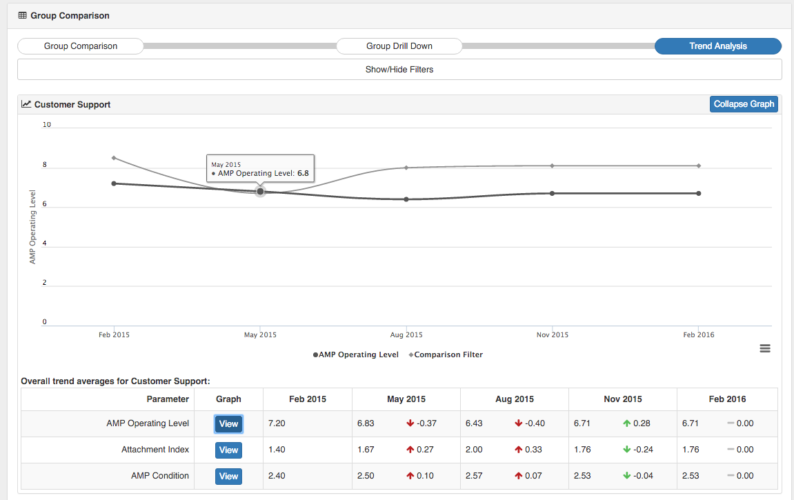
The Trend Analysis page is divided by groups, with the individual selected dimensions below each group. This helps you to quickly see how multiple groups are moving across numerous dimensions.
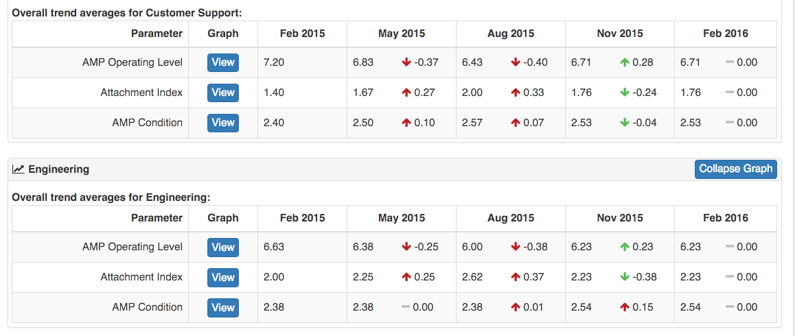
By default the page shows how the data has moved over the last year on quarterly increments. Each “cell” shows the average score for that group’s dimension for that month, and the amount of increase or decreases since the previous cell (Quarter). Positive increases or decreases are shown with a green arrow (either up or down) and negative increases or decreases are shown with a red arrow.
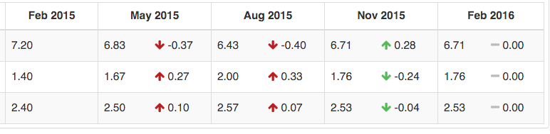
For example, if the average Operating Level score for Oct 2015 is 7.21, and the average score for Jan 2016 is 7.81, then there is a 0.6 point increase in Operating Level. This will be marked with a green up arrow, as the Operating Level increased (became better) over the period.
Graphs
One of the primary benefits of the Trend Analysis page is the ability to quickly see line charts of how a dimension has changed over time.
To view a chart for a particular group’s dimension, click the “View” button under the “Graph” heading. This will open up a graph at the top of that group’s data. The selected baseline comparison (the “Comparision Filter”) will be automatically included in the graph, letting you see how the two groups moved together. If you didn’t select a baseline, the entire company average is automatically selected as the baseline. If you prefer to not see the baseline, just click on the name “Comparison Filter” at the bottom of the chart and the line will be removed.
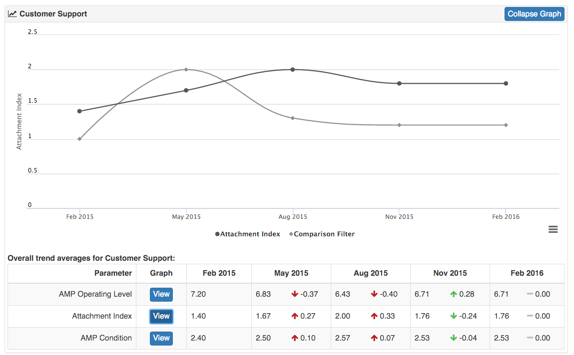
To change to a new graph, just click “View” on the new dimension you wish to view. To remove of the graph, just select “Collapse Graph.”