Comparative Analytics: Group Comparison
The Group Comparison page allows you to compare multiple groups (departments, locations, teams, etc.) across several AMP dimensions. This lets you quickly see which teams are doing well, and which teams may need support.
To access the Group Comparison page first select “Comparative Analytics” under the “Reports” drop down on the left of the AMP database. This will bring you to the Group Comparison page.

To get started with the group comparison page, you first need to select which groups you want to examine. Be default no results are shown. To select groupings, just click on one of the drop downs under the “Show groups:” section and click the groupings you would like to display.
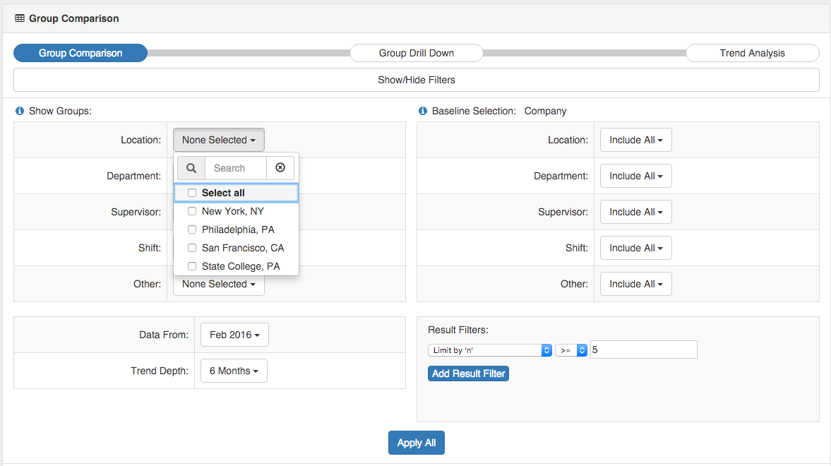
Once your desired groups are selected, click “Apply All” – your groupings should then appear.

Note: By default groupings are limited to only those that have 5 or more individuals. This helps to preserve anonymity of the individuals in the groups, and also limits large variations in the scores. For instance, the average stress in a group of 2 individuals will be much more variable than a group of 15. For this same reason, the “Limit by ‘n'” score can not be set below 3.
Filtering
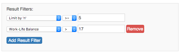
If you are interested in finding groups with certain scores, you can do this with the “Result Filters” section. This is helpful if you want to see only the results that are above a certain threshold (i.e. Work Life Balance over 17 points)
Filter options available include the majority of AMP dimensions (such as Total Stress, Respect, Work-life balance, etc.) and also the number of individuals in the group (“n” size).
Similar to the “Generate Reports” page, to filter data, select your filter dimension, the operation sign (greater than, less than, etc.) and the score you desire.
For example if you wanted to see only groups that have Work-Life Balance Stress Scores above 17, you would choose:
“Work-Life Balance > 17 ”
![]()
This will limit the results to include only those groups that have an average Work-Life Balance above 17.
Adding / Removing Filters
To add filters, click the “Add Result Filter” button. You can include as many filters as you desire.
To remove a filter, click the “Remove” button next to the filter you want to remove.
Comparing Groups:
The heart of the group comparison page is the ability to look at multiple groups at once and compare them to other groups in the database.
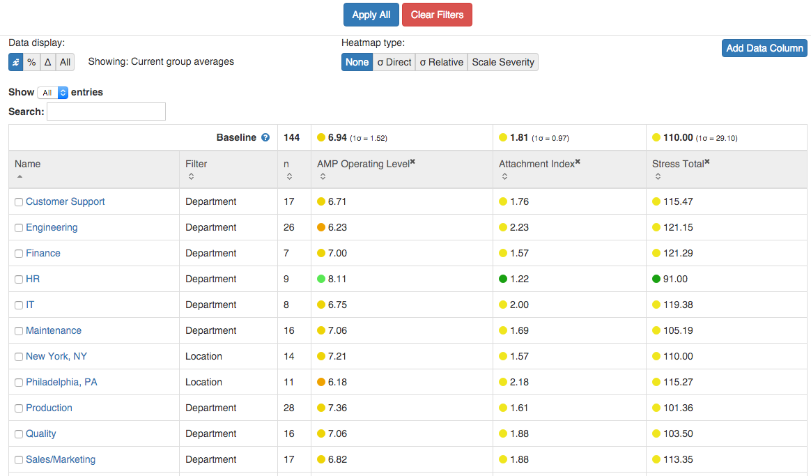
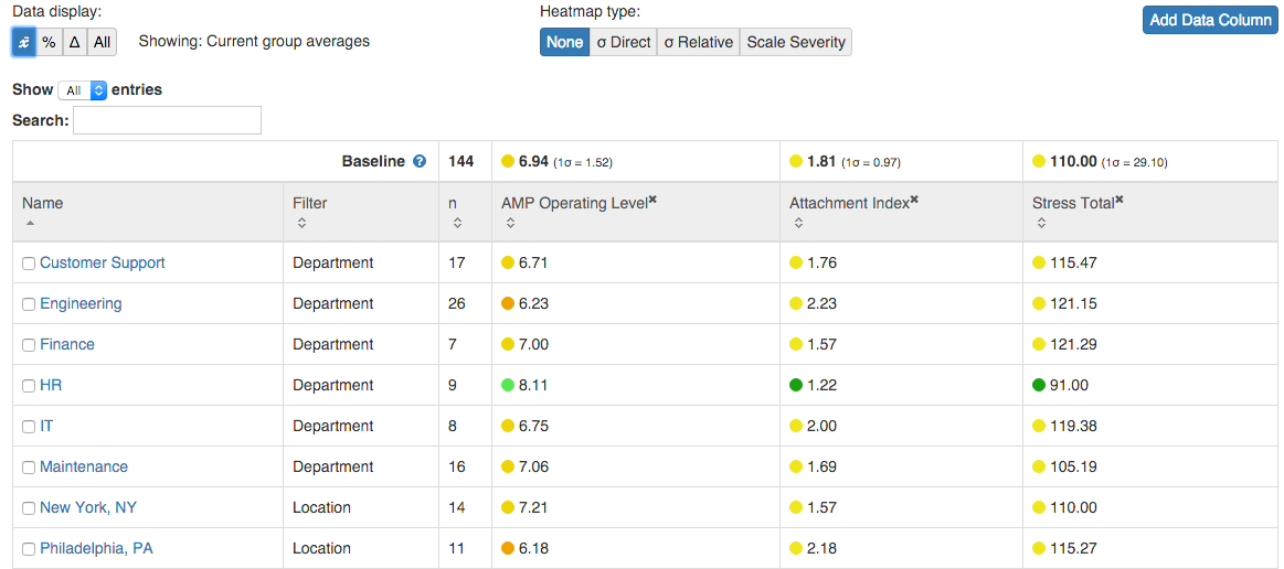
By default, the AMP dimensions displayed for each group are: AMP Operating Level, Attachment Index, and Stress Total.
Once you have selected the groups you are interested in, you can visually compare them to determine which areas you’d like to focus on. For example, if your goal is to determine which team is currently struggling the most on Stress, you easily sort the dimensions to show which group has the highest Stress scores.
Adding Dimensions
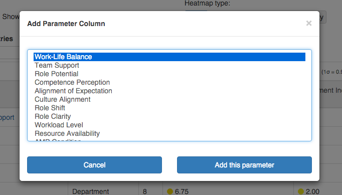
To add additional dimension columns, just click the “Add Data Column” button. This will bring up a window where you can select from many AMP dimensions. To select multiple, hold Shift and click multiple dimensions. Click “Add this Parameter” once you have selected the dimensions you desire to view.
Choosing a Data Display
There are four ways to display the data in the CA page. They can be selected by clicking one of the four options on the top left of the data viewing area.
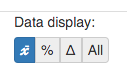
The Average (X)
This options is the default option, and shows raw average score for the group. It is interpreted the same way as the scores in the Team Health Report or Organizational Impact Summary.
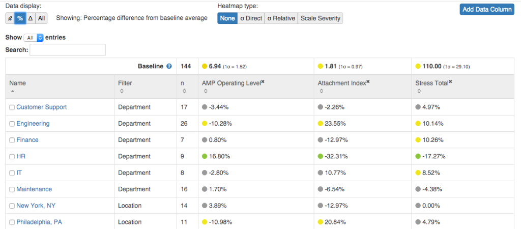
Percent Difference (%):
This option shows the percent difference between the group dimension and the baseline. For example, a 25% difference in Attachment Level means that the group’s average Attachment Level is 25% higher than the baseline average. By default the baseline is the average for your entire company’s AMP database, but can be set to any group you specify. Please see below for how to set a new baseline.
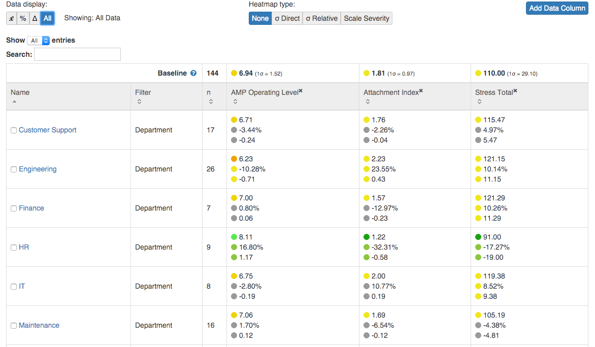
Raw Difference (∆)
This options shows the raw difference in between the group average and the the baseline average. For example, if the Attachment Level raw difference is a 0.78, it means that that group’s average Attachment Index is 0.78 points higher than the baseline’s average.

All
The last option allows you to see all the other 3 numbers at the same time – the raw average, the percent difference, and the raw difference.
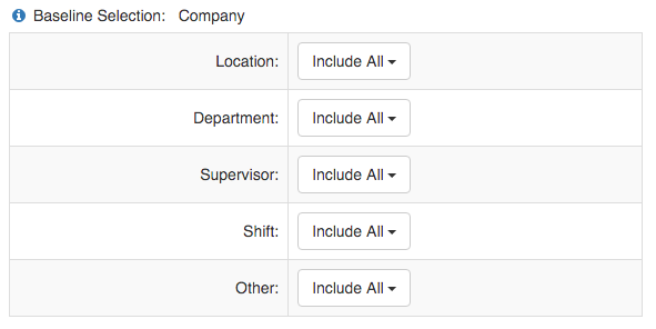
Setting a new baseline:
By default the baseline in Comparative Analytics is the average of your entire organization’s AMP database. However, you can easily set the comparison baseline to any group in your database.
The “Baseline Selection:” section on the top right of the page allows you to set a new baseline. Just select the group(s) you want as the new baseline and click the “Apply All” button.
If you select one group, the new baseline will be the average scores from that group. For example, if you selected Marketing, the average scores for the marketing department would be your new baseline.
If you select multiple groups, the average of ALL those groups combined will be your new baseline. For example, if you selected Marketing and Sales to be your baseline, the system will average together the scores of both Marketing and Sales to create a new baseline.
Heatmaps:
To help visualize the data, Comparative Analytics comes with three types of heatmaps.
Heat Map 1: Outliers
The outliers heatmap shows which teams are outliers in the data – i.e. which are significantly higher or lower than average. This helps to see if any groups are doing extremely well or need immediate assistance.
Heat Map 2: Average Gradient
The average gradient heatmap shows how far the group is from average (where average is the baseline average). For this heatmap, green is better than average, red is worse than average, and the darker the color, the farther from average the score is. This helps you quickly see where a team is in relation to the other groups.
Heat Map 3: Adjusted Gradient:
The adjusted gradient heatmap uses a blue color to indicate which cells are closer to the ‘bad’ end of the scale. This heat map is useful for quickly comparing groups and data to see where the most attention is needed when everything may seem ‘normal’ in heat maps 1 & 2.
Next steps: Drilling Down
One of the benefits of comparative analytics is that it allows you to dive deeper into the data to see what’s occurring. To do this you can use the “Group Drill Down” page to compare groups across a large number of dimensions.
You can easily flow from the Group Comparison page to the Group Drill Down page by selecting several groups and clicking “Compare Selected” on the bottom of the page. This will auto-populate the Drill Down page with the teams you selected.
To learn more about the Group Drill Down Page, please visit: Group Drill Down