Dashboard
The Dashboard is the first page you see when you log into AMP. At a glance, the dashboard shows you what is happening in your team, department, or across the organization.
Dashboard Features
Participation Statistics:
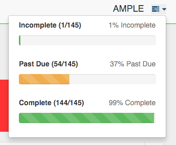
On the top right of the Dashboard, you will find the current participation rates for your selected grouping. By clicking on top right icon, you see a drop down with a breakdown of users who are incomplete (never taken AMP), past due, and complete. When you click on any of the sections in the drop down, you will be taken to the Email Users page. This helps to easily facilitate sending email reminders to those who have not completed AMP, or who are past due.
Overall Condition Summary:
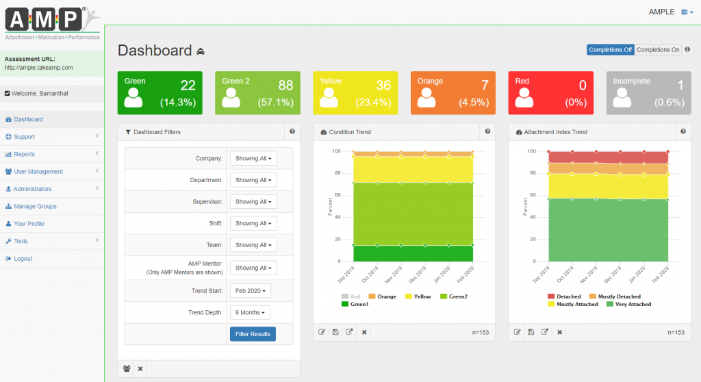
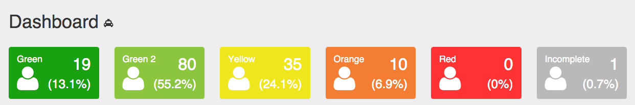
At the top of the Dashboard page you will find six boxes that display the overall condition scores for the selected group. These boxes show the number of users in each condition (Green to Red) and the percent of the total users those individuals make up. Additionally, there is a box that shows the number of incomplete users (which is grey). By clicking on any of these boxes you will be taken to the Generate Reports page, presorted with the users that correspond to the color you selected. For example, if you select the Orange box you will see all users that have a score of Orange.
Dashlets:
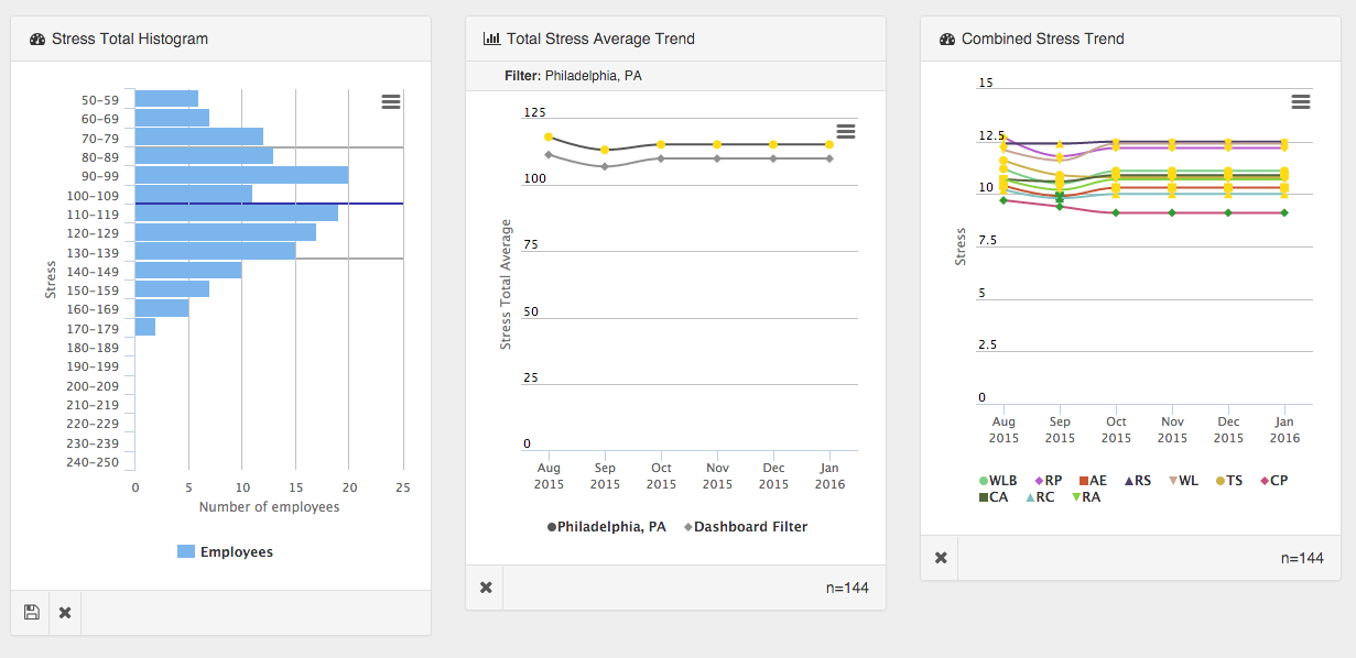
Below the Condition Summary section, you will find the Dashlets. The Dashlets make up the heart of the Dashboard page. Dashlets are windows that can display graphs or other information that you are interested in. For example, Dashlets can let you compare a simple team against the company on a particular AMP dimension, or allow you to view overall trends across the company.
AMP allows you to select which dashlets you want to see on your dashboard, so you can customize your homepage with the information relevant to your needs. Each AMP administrator gets their own personal dashboard to customize.
How to use Dashlets:
Dashlets are a powerful way to see the data in AMP. They help you analyze your data, spot trends, and serve as a way to dive deeper into the data.
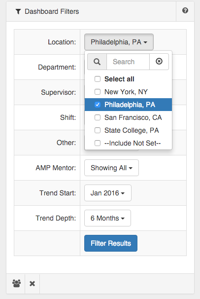
Dashboard Filters:
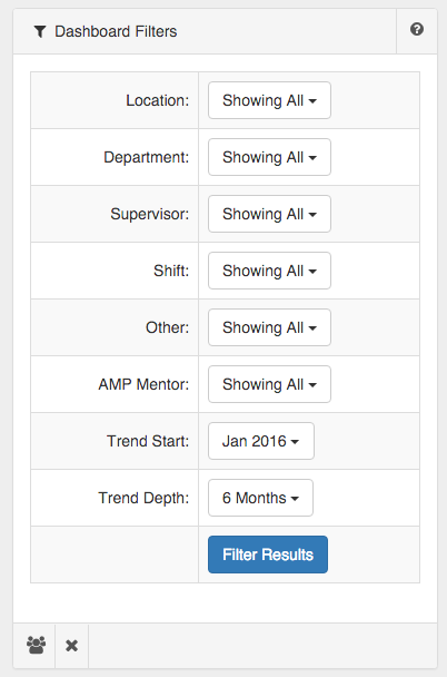
One of the primary dashlets is the “Dashboard Filters” dashlet. This dashlet lets you choose which filter you wish to view. For example, if your company has a filter for “Department,” you can select a department of interest, and all the dashlets will automatically change to show just data from that department.
Additionally, Dashboard filters allow you to specify what time period you want to see on your dashlets. For example, you can see the condition trend for the last 2 years, or just the last 2 months. To do this, just set the “Trend Start” to the month you want your data to start, and “Trend Depth” to the number of months you would like to show. For instance, if you want to see 8 months of data before June of 2015, you select June 2015 as your Trend Start and select “8 Months” as your Trend Depth.
Selecting a Dashlet:
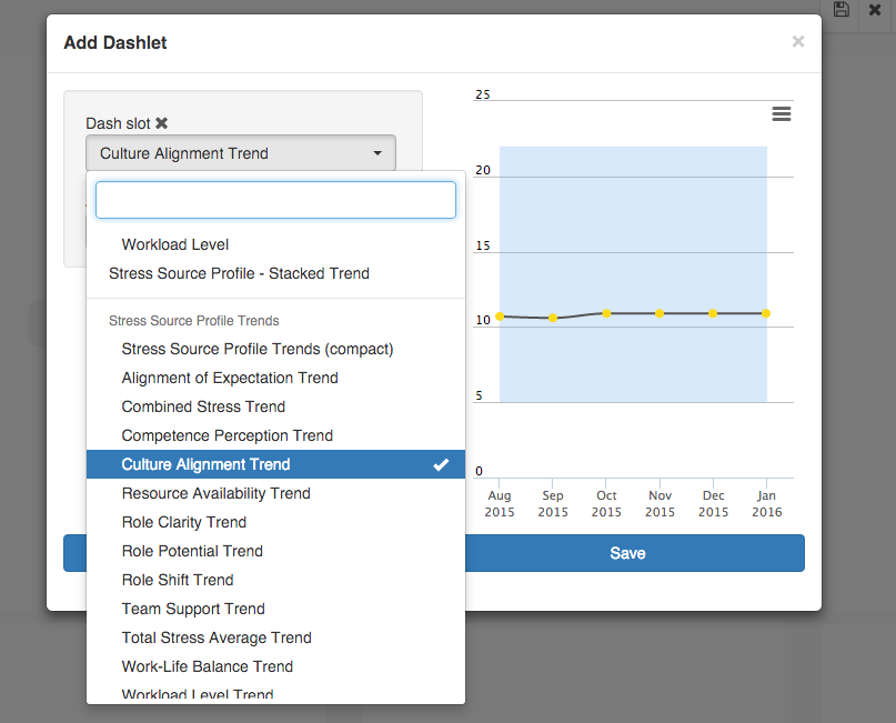
AMP allows you to select from many different types of dashlets, helping you view the data you want to see. To choose a new dashlet to display on your dashboard, select an empty dashlet spot by clicking on one of the areas marked with a “+”. There are 18 dashlet slots available to choose from.

Once you select a spot, a window will appear with several dashlet options. Choose the dropdown under “Dash Slot” and select the dashlet you would like to see. When you select a dashlet option, a preview of that dashlet will appear on the right of the window.
Once you have selected to dashlet you want, click “save.” This will bring you back to the Dashboard page, with your new dashlet in the slot you selected. Your customized Dashboard will be automatically saved and you dashlet will appear in the same spot the next time you log in.
Removing a Dashlet:
To remove a Dashlet, just select the “X” on the bottom left of the dashlet area. This will free up that Dashlet slot to be used by another dashlet.
Printing and Saving as image:
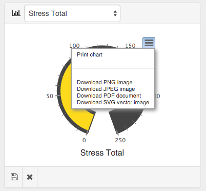
You can easily download an image or PDF of a Dashlet. This helps if you are inserting them into a report or other document.
To do this, select the menu on the top right of the Dashlet area (the “hamburger”). From here you are given options to print the dashlet, or save as a PDF, JPEG, PNG, or SVG document.
Comparing Dashlets and Saving Dashlet Filters:
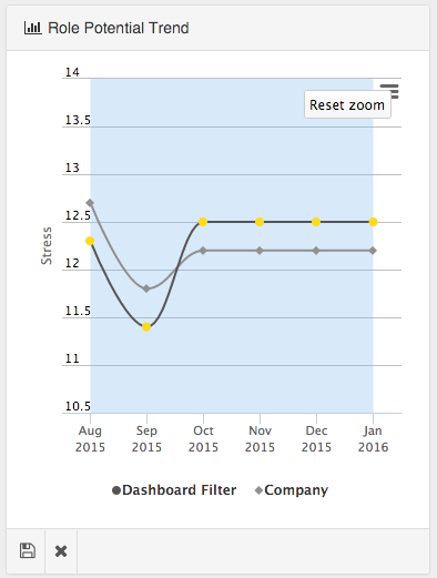
Certain Dashlets also allow you to compare groups (filters) to see how they have trended over time.
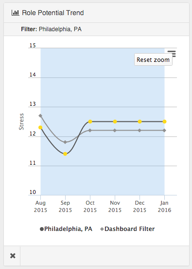
To compare two filters on a dashlet, first select a filter you would like to view. For example, if you have location filter for “Philadelphia”, you can select that filter to see results just for Philadelphia.
Next scroll to a “Trend” (line chart) dashlet you want to view. The dashlet should now show both the “Company” trend and the “Dashboard Filter” trend (in this case Philadelphia).
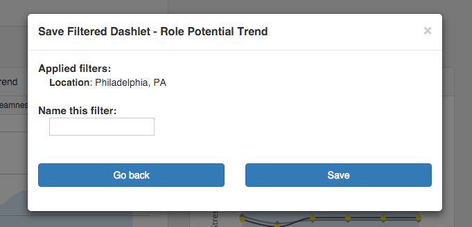
If you always want to have this comparison on your Dashboard for this particular dashlet, you can save the filter for this dashlet. This will allow the comparison to remain on the dashboard, while other filters are applied.
To do this, click the “Save” icon on the bottom left corner of the dashlet. This will open a window with a prompt to enter a name for this new saved filter. Generally it is best to name the filter as the filter itself (i.e. “Philadephia”) so it is easy to remember later. Then click “Save.”
You can now change the Dashlet Filter, and your comparison Dashlet with the Company trend and the saved filter trend will still be available.